Monitor and visualize anomalies with Netdata (part 2)
Welcome to part 2 of our series of guides on using unsupervised anomaly detection to detect issues with your systems, containers, and applications using the open-source Netdata Agent. For an introduction to detecting anomalies and monitoring associated metrics, see part 1, which covers prerequisites and configuration basics.
With anomaly detection in the Netdata Agent set up, you will now want to visualize and monitor which charts have anomalous data, when, and where to look next.
💡 In certain cases, the anomalies collector doesn't start immediately after restarting the Netdata Agent. If this happens, you won't see the dashboard section or the relevant charts right away. Wait a minute or two, refresh, and look again. If the anomalies charts and alarms are still not present, investigate the error log with
less /var/log/netdata/error.log | grep anomalies.
Test anomaly detection
Time to see the Netdata Agent's unsupervised anomaly detection in action. To trigger anomalies on the Nginx web server,
use ab, otherwise known as Apache Bench. Despite its name, it
works just as well with Nginx web servers. Install it on Ubuntu/Debian systems with sudo apt install apache2-utils.
💡 If you haven't followed the guide's example of using Nginx, an easy way to test anomaly detection on your node is to use the
stress-ngcommand, which is available on most Linux distributions. Runstress-ng --cpu 0to create CPU stress orstress-ng --vm 0for RAM stress. Each test will cause some "collateral damage," in that you may see CPU utilization rise when running the RAM test, and vice versa.
The following test creates a minimum of 10,000,000 requests for Nginx to handle, with a maximum of 10 at any given time,
with a run time of 60 seconds. If your system can handle those 10,000,000 in less than 60 seconds, ab will keep
sending requests until the timer runs out.
ab -k -c 10 -t 60 -n 10000000 http://127.0.0.1/
Let's see how Netdata detects this anomalous behavior and propagates information to you through preconfigured alarms and dashboards that automatically organize anomaly detection metrics into meaningful charts to help you begin root cause analysis (RCA).
Monitor anomalies with alarms
The anomalies collector creates two "classes" of alarms for each chart captured by the charts_regex setting. All these
alarms are preconfigured based on your configuration in
anomalies.conf. With the charts_regex
and charts_to_exclude settings from part 1 of this guide series, the
Netdata Agent creates 32 alarms driven by unsupervised anomaly detection.
The first class triggers warning alarms when the average anomaly probability for a given chart has stayed above 50% for at least the last two minutes.
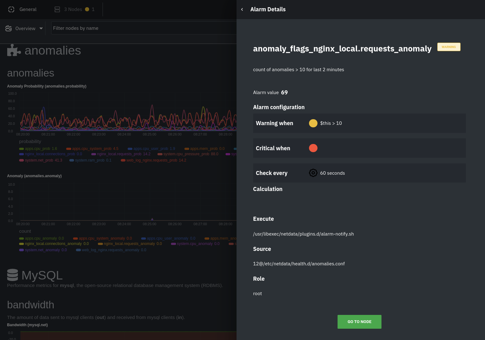
The second class triggers warning alarms when the number of anomalies in the last two minutes hits 10 or higher.
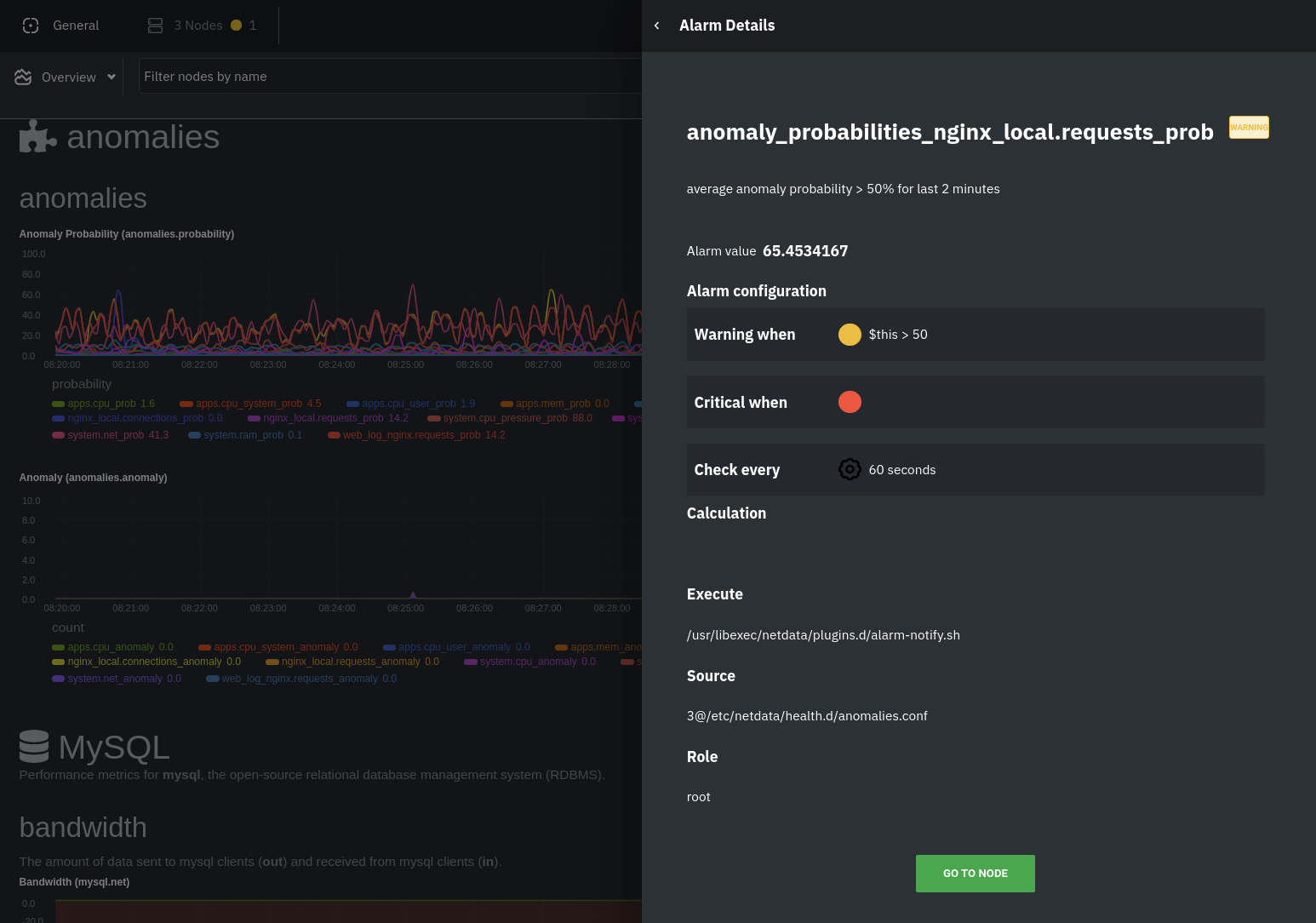
If you see either of these alarms in Netdata Cloud, the local Agent dashboard, or on your preferred notification platform, it's a safe bet that the node's current metrics have deviated from normal. That doesn't necessarily mean there's a full-blown incident, depending on what application/service you're using anomaly detection on, but it's worth further investigation.
As you use the anomalies collector, you may find that the default settings provide too many or too few genuine alarms.
In this case, configure the alarm with sudo ./edit-config
health.d/anomalies.conf. Take a look at the lookup line syntax in the health
reference to understand how the anomalies collector automatically creates
alarms for any dimension on the anomalies_local.probability and anomalies_local.anomaly charts.
Visualize anomalies in charts
In either Netdata Cloud or the local Agent dashboard at http://NODE:19999, click on the
Anomalies section to see the pair of anomaly detection charts, which are
preconfigured to visualize per-second anomaly metrics based on your configuration in
anomalies.conf.
These charts have the contexts anomalies.probability and anomalies.anomaly. Together, these charts
create meaningful visualizations for immediately recognizing not only that something is going wrong on your node, but
give context as to where to look next.
The anomalies_local.probability chart shows the probability that the latest observed data is anomalous, based on the
trained model. The anomalies_local.anomaly chart visualizes 0→1 predictions based on whether the latest observed
data is anomalous based on the trained model. Both charts share the same dimensions, which you configured via
charts_regex and charts_to_exclude in part 1.
In other words, the probability chart shows the amplitude of the anomaly, whereas the anomaly chart provides quick
yes/no context.
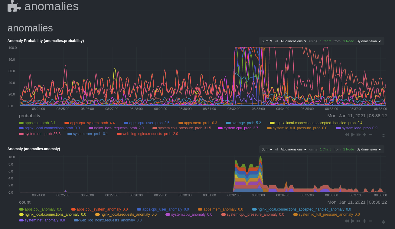
Before 08:32:00, both charts show little in the way of verified anomalies. Based on the metrics the anomalies
collector has trained on, a certain percentage of anomaly probability score is normal, as seen in the
web_log_nginx_requests_prob dimension and a few others. What you're looking for is large deviations from the "noise"
in the anomalies.probability chart, or any increments to the anomalies.anomaly chart.
Unsurprisingly, the stress test that began at 08:32:00 caused significant changes to these charts. The three
dimensions that immediately shot to 100% anomaly probability, and remained there during the test, were
web_log_nginx.requests_prob, nginx_local.connections_accepted_handled_prob, and system.cpu_pressure_prob.
Build an anomaly detection dashboard
Netdata Cloud features a drag-and-drop dashboard editor that helps you create entirely new dashboards with charts targeted for your specific applications.
For example, here's a dashboard designed for visualizing anomalies present in an Nginx web server, including documentation about why the dashboard exists and where to look next based on what you're seeing:
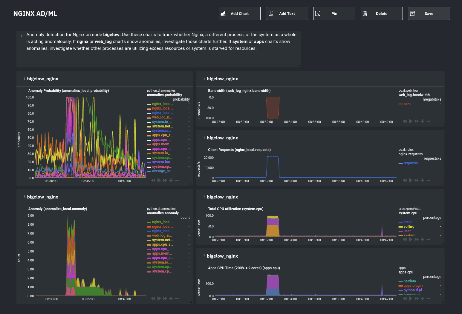
Use the anomaly charts for instant visual identification of potential anomalies, and then Nginx-specific charts, in the right column, to validate whether the probability and anomaly counters are showing a valid incident worth further investigation using Metric Correlations to narrow the dashboard into only the charts relevant to what you're seeing from the anomalies collector.
What's next?
Between this guide and part 1, which covered setup and configuration, you now have a fundamental understanding of how unsupervised anomaly detection in Netdata works, from root cause to alarms to preconfigured or custom dashboards.
We'd love to hear your feedback on the anomalies collector. Hop over to the community forum, and let us know if you're already getting value from unsupervised anomaly detection, or would like to see something added to it. You might even post a custom configuration that works well for monitoring some other popular application, like MySQL, PostgreSQL, Redis, or anything else we support through collectors.
Related reference documentation
Was this page helpful?
Need further help?
Search for an answer in our community forum.
Contribute
- Join our community forum
- Learn how to contribute to Netdata's open-source project
- Submit a feature request